简介
最近做的一个CMS后台系统项目频繁遇到表单和表格,该项目用到element-ui,参考前人对element-ui的封装,总结下form表单和table组件的封装方法,加深对组件化开发的理解
前述
- 在此项目之前,我理解的封装一直都是一个组件的封装,单一功能的封装。因为封装好的组件通常是UI组件,上面顶多有几个属性和事件。直到遇到大量的form表单和table表格,才需要在一个组件中封装更多的功能,且需要在父组件取到子组件的数据。
- element-ui的二次封装我之前没有思考过。由于element-ui的组件本身已经足够方便,但诸如表单dom的配置仍然是写在template中,这造成复用时仍然在写大量重复代码。
- 从使用的角度看,element-ui仍然需要去写dom(即模板)。为了实现更好的配置化即在vue的data中通过数据驱动视图,将几乎所有常用的form/table再封装成为自然的选择。
- 这样做的缺点是丧失一定的灵活性,但同一项目中的二次封装能够提高form/table组件的开发效率,如果有新的需求,再去扩展和丰富原组件的封装
- 前人的封装方法是建立Vue2.0或者较早的版本上,因此大量使用了Vue.component(‘my-form’,{})和Vue.extend以及模板的ES5字符串拼接,现在已经过时,当前更适合用单文件组件去做封装的子组件。所用的slot-scope来取到子组件内部数据流的Api方法也已经废弃,需要了解最新的v-slot的API
- 本文主要是为了梳理封装方法,更多理解组件封装。
form封装实例
效果
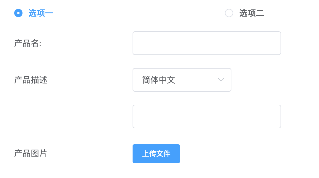
代码解析
封装后模板
<my-form :form="queryForm"/>
js数据
export default {
    data () {
        return {
            queryForm: {
                // my-form组件根属性
                labelwidth: '200px',
                inline: false,
                labelposition: 'left',

                // my-form组件的props,存放所有表单值
                props: {
                    product_type: 'inline',
                    product_name: '',
                    product_des: 'Chinese',
                    product_des_options: '',
                    product_img: ''
                },

                // my-form组件的dom结构属性
                attributes: [
                    {
                        prop: 'product_type',
                        type: 'require_radio',
                        style: 'width: 60%; margin-left:-200px;',
                        options: [
                            {
                                label: '选项一',
                                value: 'inline'
                            },
                            {
                                label: '选项二',
                                value: 'light'
                            }
                        ],
                        // 一些操作表单的事件,changeEvent写在当前vue文件中
                        onChange: this.changeEvent
                    }, {
                        prop: 'product_name',
                        label: '产品名:',
                        style: 'width: 30%;',
                        isHide: false
                    }, {
                        prop: 'product_des',
                        label: '产品描述',
                        style: 'width: 20%',
                        type: 'select',
                        options: [
                            {
                                label: '简体中文',
                                value: 'Chinese'
                            },
                            {
                                label: '英文',
                                value: 'English'
                            }, {
                                label: '法文',
                                value: 'Franch'
                            }, {
                                label: '日文',
                                value: 'Japanese'
                            }
                        ]
                    }, {
                        prop: 'product_des_options',
                        style: 'width: 30%'
                    }, {
                        prop: 'product_img',
                        label: '产品图片',
                        size: 'small',
                        type: 'uploadImg'
                    }
                ]
            }
        };
    }
}
子组件模板
<el-form ref="myform" :model="form.props" :inline="form.inline" :label-position="form.labelposition" :label-width="form.labelwidth" :action="form.action" :method="form.method" :enctype="form.enctype" :accept-charset="form.acceptCharset" style>
	<template v-for="item in form.attributes" v-if="!item.isHide">
			/* ---------------------基本的表单形式-------------------*/
		// 展示文本
		<template v-if="item.type===\'plantext\'">
			<el-form-item :item="item" :label="item.label" :prop="item.prop" :style="item.style" :label-width="item.labelwidth">
				{{form.props[item.prop]}}
			</el-form-item>
		</template>
		<template v-else-if="item.type===\'select\'">
			<myselect :form="form" :item="item" :filterable="item.filterable" />
		</template>
		<template v-else>
			<myinput :form="form" :item="item" :rules="leInputRules"/>
		</template>
	</template>
可以看到:
- queryform的一级属性用来设置最外层el-form组件的dom属性
- attributes中的每一项是每个自定义组件结构需要的属性
以myselect组件为例:
<el-form-item :label="item.label" :prop="item.prop" :rules="rules" :label-width="item.labelwidth" :style="item.itemStyle">
    <el-select :style="item.style || inputStyle" v-model="form.props[item.prop]" @change="onSelectChange" :multiple="multiple" :placeholder="item.placeholder" :disabled="item.disabled || disabled">
        <el-option v-for="opt in item.options" :disabled="opt.disabled" :label="opt.label" :value="opt.value" :key="opt.value"></el-option>
    </el-select>
</el-form-item>
这里的关键是子组件的属性怎么能反映到最终
methods: {
   onSelectChange: function (val) {
        this.item.onChange && this.item.onChange.call(null, val);
   }
}
通过在子组件中执行item中的方法即可,这意味着配置数据attributes项中能直接写change的监听方法(queryform中例子)
onChange: this.triggerChange
triggerChange(flag)的flag可以直接获得当前选中的值(这依赖于element-ui本身)
table封装实例
效果
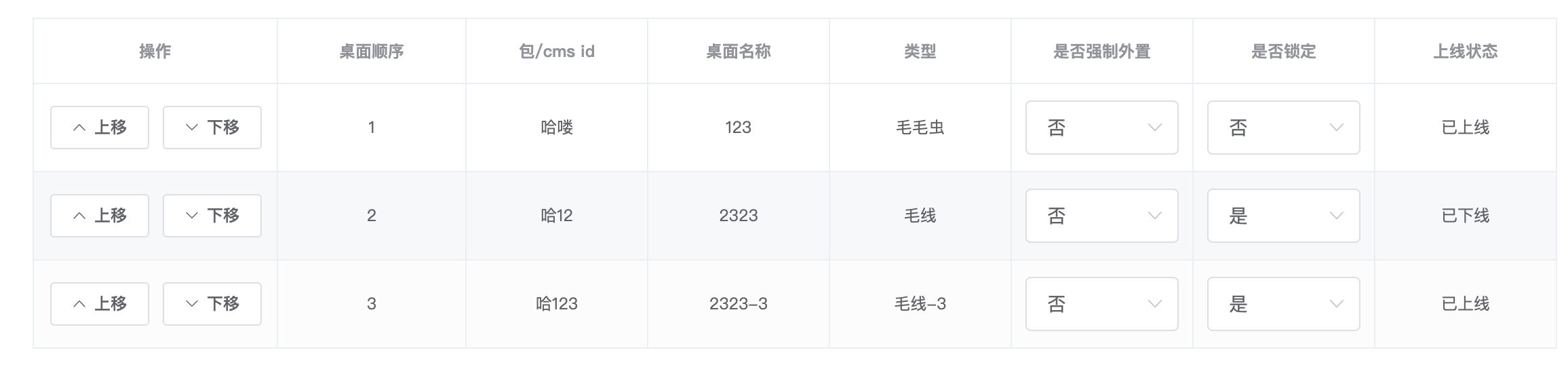
代码解析
封装后模板
<my-table :table="table"></le-table>
js数据
table: {
    loading: false,
    attributes: [
        {
            prop: 'action',
            label: '操作',
            type: 'ifelse',
            width: '180',
            align: 'center',
            isHide: true,
            options: [
                {
                    title: '上移',
                    icon: 'el-icon-arrow-up',
                    // disabled: 'disabled',
                    onClick: this.moveTo.bind(this, 'up')
                }, {
                    title: '下移',
                    icon: 'el-icon-arrow-down',
                    onClick: this.moveTo.bind(this, 'down')
                }
            ]
        },
        {
            prop: 'order',
            label: '桌面顺序',
            align: 'center'
            // type: 'index'
            // width: 60
        },
        {
            prop: 'name',
            label: '包/cms id',
            align: 'center'
        }, {
            prop: 'deskName',
            label: '桌面名称',
            align: 'center'
            // width: 80
        }, {
            prop: 'type',
            label: '类型',
            align: 'center'
            // width: 90
        }, {
            prop: 'isOutput',
            label: '是否强制外置',
            align: 'center',
            type: 'ifelseSelect',
            // checkvalue: 'no',
            disabled: true,
            options: [
                {
                    label: '是',
                    value: 'yes'
                },
                {
                    label: '否',
                    value: 'no'
                }
            ]
        }, {
            prop: 'isLock',
            label: '是否锁定',
            align: 'center',
            type: 'ifelseSelect',
            // checkvalue: 'yes',
            disabled: true,
            options: [
                {
                    label: '是',
                    value: 'yes'
                },
                {
                    label: '否',
                    value: 'no'
                }
            ]
        }, {
            prop: 'status',
            label: '上线状态',
            align: 'center'
        }
    ],
    data: [
        {
            order: 1,
            name: '哈喽',
            deskName: '123',
            type: '毛毛虫',
            isOutput: 'no',
            isLock: 'no',
            status: '已上线'
        },
        {
            order: 2,
            name: '哈12',
            deskName: '2323',
            type: '毛线',
            isOutput: 'no',
            isLock: 'yes',
            status: '已下线'
        },
        {
            order: 3,
            name: '哈123',
            deskName: '2323-3',
            type: '毛线-3',
            isOutput: 'no',
            isLock: 'yes',
            status: '已上线'
        }
    ]
}
注意点:
- 最终的列表交互后数据存放在table的data数组中,而通过改变data数据,视图也会变好
- table比form封装值得注意的是子组件到父组件数据的流动,也即slot-scope的使用问题
子组件模板
<el-table v-loading="table.loading" element-loading-text="加载中.." ref="mytable"
:data="table.data"  :show-header="table.showHeader" :height = "table.height">
    // 每一行
    <el-table-column v-for="item in table.attributes" :key="item.prop" v-if="!item.isHide"
    :width="item.width" :type="item.type" :fixed="item.fixed" :prop="item.prop" :label="item.label"
    :sortable="item.sortable" :sort-method="item.sortMethod" :formatter="item.formatter" :align="table.align || item.align" >
        // 具体内容
        <template slot-scope="scope">

            // select类型表格
            <template v-else-if="item.type==='select'">
                <el-select :disabled="item.disabled" v-model="scope.row[item.prop]"
                @change="item.onChange(scope.$index, scope.row, item.prop, scope.row[item.prop])"
                placeholder="请选择">
                    <el-option v-for="opt in item.options" :key="opt.value" :label="opt.label" :value="opt.value"></el-option>
                </el-select>
            </template>

            // ifelseselect类型表格
            <template v-if="item.type==='ifelseSelect'">
                <myselect :scope=scope :item=item></myselect>
            </template>

            // 默认类型表格
            <template v-else :style="item.style">
                {{getCurrentProp(scope.row, item.prop, item)}}'+
            </template>
        </template>
    </el-table-column>
</el-table>
以上:
- scope可以理解为数据域:scope.row是行数据,即data中对这样渲染结果生效的数据对象,scope.$index是data的索引值
- slot-scope(作用域插槽)是数据子向父传递的神器,他能够获得驱动视图的数据,而使用$emit等事件没有执行时机,无法将数据传回父组件
- slot-scope已经废弃,替代使用的是v-slot,那v-slot如何解决slot和slot-scope的问题?
父组件中通过v-slot指令写插槽,插槽名为header,数据域为slotProps(随意命名)
```html
<template v-slot:header="slotProps">
    <h1>{{slotProps.header + ' ' + msg}}</h1>
</template>
```
子组件的header可以在父组件的slotProps对象中取到
<header>
    <slot name="header" :header="header"></slot>
</header>
export default {
    data() {
        return {
            header: '来自子组件的头部消息'
        }
    }
}
应该说v-slot更直观,与vue其他指令更一致
总结
- 封装要向着易用的方向进行(将数据驱动视图进行到底)
- 思维不要局限在形式上(有了封装可以再封装)
- 封装的思想最重要,而不是技巧和API
评论 0
还没有评论,来抢个沙发吧。